
Project Information
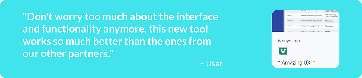
Summary
In the past a dashboard was built without involving a UX designer, not even a product designer. You can guess what happened. The dashboard was fine, users taught themselves to work with it, there was no better alternative and support tickets were raised often. That situation is fine, if you try to empty the ocean with a thimble.
Luckily, they didn't try to do that and enhanced the Product Team with an UX Designer, me.
The team was clever and started gathering data before I got hired, so I could immediately start analysing. Also, my colleagues taught me much about the users, the product and our business goals.
Soon I felt comfortable and knowledgeable about the issues with the tool and I started my own thorough research and prototypes followed quickly. Amazing communication in the team and with our users made it much fun to work on this project and helped us develop a new tool with a great user experience.
Overview
Project date: 09/2022 - 02/2023
Researchers and designers: Fabienne Heijne
Coworkers: 1 Project Lead, 2 Full Stack Developers, 1 UX Writer, Customer Success Managers and other experts.
Goal
Improve the user experience:
- research the user needs and the possible solutions
- create prototypes and conduct usability tests
- create high fidelity prototypes for development
- test and launch the product
My role
I am the only designer in this company, so I am responsible for the end-to-end design. I say 'I' very often in my story here, that is because I did almost everything myself. Of course I mention other stakeholders as much as possible, because I think they deserve the credits too. Good communication with the users and between my coworkers and I made us able to create wonderful user experiences.
Empathise
Audit, support tickets, expert interviews, Hotjar & usability testing
To understand our users and their struggles with the tool, I audited the dashboards, analysed the support tickets and spoke with the Customer Success Managers. Additionally I analysed our Hotjar results.
Below you see a part of my user research. I needed to understand their journey to be able to create an improved dashboard with a great user experience. I asked everybody who was involved to teach me as much as possible about the users, the tool and their pain points.
With this information I managed to create user journeys for the different cases and persona's.
Audit
When I audited the tool I was sceptical about every element. For every aspect I considered the functionality, intention and usefulness. I did this together with the users and other stakeholders.
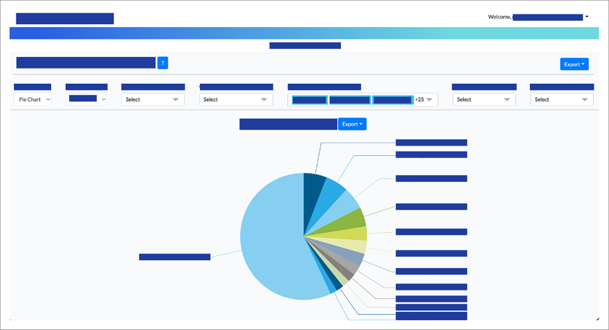
Chart view of the tool.

Tabular view of the tool.
Quantitative research - Hotjar
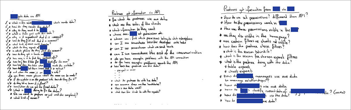
I analysed the recordings in Hotjar and found many trends in remarkable behaviour. This behaviour gave me many insights, which I needed to verify. Below and in the image underneath you can see what kind of questions I asked the users, myself and my colleagues.
Understanding purpose
- What is the purpose of this page?
- What is in your opinion the most important information to show in the tool?
- Could you prioritise this information for me per category?
- Is the export relevant?
User needs
- Do users want to have the choice between chart/table/pivot table?
- Does the user want to select only one country or more? Or maybe a region?
- Is the export in a file format that the user is able to use?
Being sceptical about existing features - do we need it
- Is it possible to show ... in a different way?
- Could 'group by' be shown in a better way?
- Would you present the information in a different way?
- Is it necessary to show all columns?
- Are the ... levels relevant to the users?
- Is the ... relevant to the users?
Being sceptical about existing features - do users understand it
- Are the names used in the dropdown understandable for the users?
- Are the filter options recognisable?
- Do you find it easy to find the information which you need?
- Do you remember the first time when you used the tool?
- Did you find it easy to find the information back then?
- What in the tool bothers you regarding the shown information?
- Is there an easier way for the users to select the from and to dropdowns?
- Is there an easier way to select the ... type?
- Is there another way to select the country?
- Is there a better way to show the chosen filter options?
- What do you think about the navigation of the tool?
Qualitative Research - Usability testing former dashboard
After I analysed the Hotjar recordings, support tickets and information from my colleagues, I had a good basic understanding of what could go wrong. So I conducted user tests on the dashboard to verify if my thoughts were correct and to learn more about the thoughts behind the behaviour which I saw and heard of.
I asked questions to understand the issues that our users encountered and let them present their screen so that I could watch their behaviour. My questions can be divided in a few categories:
- Does the user understand the purpose of the project/which purpose does the user need from our product?
- Do our users need specific features or information that we can provide for them in the dashboard?
- Do we need the features and information that we provided in the dashboard?
- Do our users understand the features and information that we provided in the dashboard?
Together with the users I brainstormed. I let them tell about me the issues they encountered. To make them feel valued I asked them for possible solutions, the answers I used to drill through till I found the underlying issues.

Pain points
Here I summarise the most important pain points to give you an idea of what was wrong. This is not the full list.
Placement of elements
- The export button for the first chart is above the general filter panel.
- The horizontal scrollbar is positioned at the end of the data table, below the fold, this can cause excessive vertical scrolling.
- Filters resize and jump, which resizes the filter panel.
- Only a selection of the selected filter items is shown, which has no value.
- Illogical order of filters causes many mouse movements.
- Users need to search for the filters, since the orders are inconsistent and illogical on different pages.
- A pie chart is displayed so large that users need to scroll to see the second one or are not even aware that there is more to see.
Reliability
- The colours and other style elements don't fit the brand style.
- Difficult jargon.
- Similar terms with different meanings.
- Ranges in filters are mathematically incorrect and seem to show overlap in data.
- We do not support the tool on mobile, but an unusable version, which seems to work, is displayed anyway.
- Missing dependencies between filters, causes much clutter in the design and much scrolling through items.
- Data in the tables differs from the data in the downloaded csv files.
User journeys & Persona's
All the research that I conducted helped me understand the users and their problems with our tool. I discussed the persona's and user journeys thoroughly with the Product Lead and the Customer Success Managers to be sure that I had a good understanding of the people that use our products and what they need from our products.
Example of one of my ways to understand the users and their needs.
Below you see an overview of the different cases and the journeys of the users, blurry, to avoid sharing confidential insights, and the personas.

User journeys.

Personas
Define
To define the problems I conducted thorough user research using the various methods described above.
Problem statement
While using our dashboard partners encounter issues in their user experience, mostly because of improvident functionality.
Ideate
When I dove into the creative phase, I first took apart every component, idea and intention of the former tool and used the left-overs as building blocks for the new tool. I prioritised, categorised, discussed and sketched a lot together with users and other stakeholders.
Cleaning existing elements and components
I created a list of all the elements and components. I categorised them to create consistency, I removed some since they didn't add value and other elements I merged.
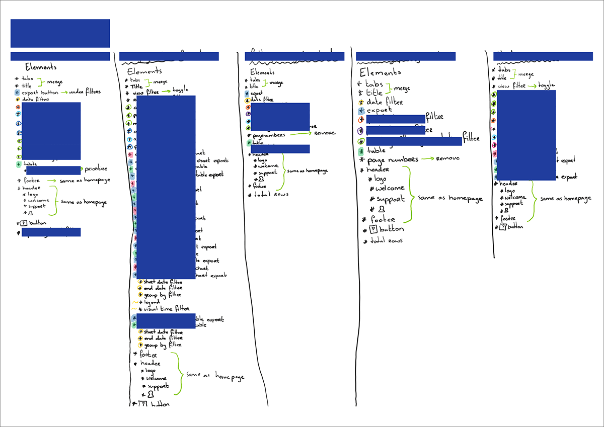
Process of cleaning elements.
MoSCoW method
All my findings, I translated to a long list of requirements. This list I categorised and prioritised from a UX perspective, using the MoSCoW method and logic. This version I revised together with the Product Lead and the developers to get a prioritised requirement list, which suited the wishes of all the stakeholders and contained items that were feasible in time and budget.
Sketches
After prioritising the requirements I started with sketching. Below I added a screenshot of the first round of sketches. I used it in the first place to discuss with the product lead, if I understood the matter correctly. I didn't want to start the usability testing, if there were still wrong assumptions from my side, which were clear for the other stakeholders.
With the users I tested different versions of low-fidelity sketches. Pointed out that they needed to feel free to give any feedback and could still change the whole design with me. The tests were very useful and much fun. We recorded all tests for later reference.
First sketches.

Next iteration of sketches.
Prototyping & Usability testing
Communication
Going through several iterations we got an end result. While prototyping I started with sketches and went via low fidelity prototypes to high fidelity prototypes. The whole team agreed with this prototype, because communication throughout the process was key. I spoke with all the important stakeholders. Users, developers, product lead, commercial team and other experts. This communication plays an important role in my iterations. I discuss, produce prototypes, discuss, check for feasibility, prototype again, and so on, until we have a great end result.
Example questions from the usability tests
A few examples of questions that I had you see below, I don't mention the questions that give away confidential information. The tests took around 45 minutes per session.
Behaviour
- Could you show me the data for every Monday in Q1?
- Could you tell me for which groupings you can see data?
- Which filters do you usually use?
Interpretation
- Are certain terms unclear for you?
- What was the one thing you disliked the most about the dashboard?
Purpose
- Do you have colleagues who visit the dashboard for different goals than you?
- What do you do before and after exporting the data?
- Can you prioritise the information which you are looking for?

1) Low fidelity prototypes, 2) Mid fidelity prototypes, 3) Interactions in low fidelity prototypes.
Information Architecture
The main structure of the reports I didn't need to touch. The different tabs were already in a good order, according to user research and commercial wishes.
Interaction
The functionality of the tool was very wrong, so 95% of the tool needed to be redesigned. For the developers there were many new elements and interactions, so I created flows in which they could look up all the preferred behaviour.
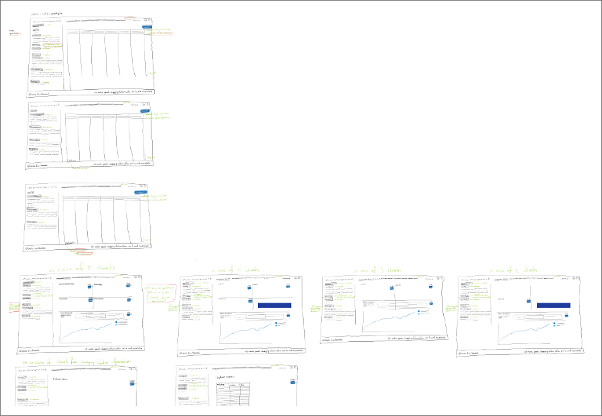
Permissions
Our users have different permissions, so they don't see the same amount of charts. This would affect the main structure of the pages, so I created overviews to show how the pages would look for different permissions. It needed to be intuitive, easy to interpret and visually attractive.

Interaction flows for one report.

Page structures for variations in permissions.

Considerations
There were many considerations. A few I summarise below.
Mathematically incorrect filter ranges
Users don't understand the range filters well. According to the filter the ranges overlap, but that is not really the case. So we changed 1 - 100, 100 - 200 into 0 < P ≤ 100, 100 < P ≤ 200.
Pie charts
I expected that users would prefer to compare data in bar charts, but in almost every test I saw a strong preference for pie charts instead. We kept the bar charts as a wish, an alternative under a toggle switch.
Categorisation of filters
For easy findability, recognition and short distances, I categorised the filters and reordered them.
Global and Local filters
I changed the position of a few filters from the general filters to the panel they apply to. It is much more intuitive now, since these filters only apply on one chart.
Icons and text in the tables
For faster interpretation and more inclusive design (visual and textual learners), I added icons and text to certain columns.
Show selected filter items on top
In the former version the first few items of a selection were shown in the filter. If 100 items were selected, the user would only see three in a single glance. It also wouldn't be great to show all selected items underneath the filters, the filters would jump to other places and the filter panel would be cluttered. So I decided to show all selected items in the top of the filter dropdown menu. In a single glance the user can see how many items are selected and after 1 click the user will see which items are selected. With this improvement I could also set a fixed filter size, jumping filters belong to the past for sure now.
Brand colours and other style elements
The colours in the dashboard didn't fit the brand style. For more reliability I fitted the colours and the rest of the style to the brand style.
Scrollbars
Instead of having a horizontal scrollbar at the end of the table, I inserted the scrollbar above the fold to avoid endless vertical scrolling through our big amounts of data.
Chart sizes
I changed the chart sizes, so that more would fit above the fold and to give the user a hint that there is more to see below the fold.
Changing jargon
I replaced jargon where possible to better understandable labels.
'... level' I replaced with '... level (unit)'. We also had ... type and users would click all the time on these filters to find out it was the wrong one.
I added tooltips there where changing jargon wasn't possible. In our data tables we don't want to change the headers, since the headers need to be exactly the same as in the download. To avoid confusion and to avoid loss of reliability.
Accessibility
I needed to add quite a few extra colours to the brand style to show the data in the pie- and line charts. I tested many colours with colleagues and ran the 'Colour Blind' plugin to check accessibility for every kind of colour blindness. Some colleagues interpreted green- and blueish colours as similar and some purple- and blueish.
It took me four iterations to get a good colour set. I tested with different colours and with the same colours in different orders and in different sizes.
The line charts needed a set outside of the brand style, since all the blueish colours would look the same on a line thickness of 1px. The pie chart slices I gave a white stroke, for those who still had trouble differentiating between the colours.

1) Icons and text in tables, 2) Show selected filter items on top, 3) Brand colors, 4) Color tests.
Prototypes
The low fidelity prototypes in Figma were fully interactive, because I wanted to see the behaviour of our users and I wanted to be able to talk about real interactions instead of suggestions. I created high fidelity prototypes in Figma to verify if we were really going into the right direction with building the product, a last check on functionality. This was also a moment to conduct final internal testing on the design itself, a moment to zoom in on every detail, remove small errors and make the prototype pixel perfect.

A few high fidelity prototypes in Figma.
Last phase
After all the iterations I finalised a document for the developers and other stakeholders with all the information that I didn't want to write in Figma (considerations, rules, etc.) and I finished a thorough test plan which we could use to test the product before going live.
Documentation
Mainly for the developers, but also for other team members and myself, I created a thorough document which contained all the considerations in the projects. It showed interactions, rejected thoughts, everything that we shouldn't forget, but what we didn't want to show in the Figma file.
Test plan
Since I document a lot and keep lists up to date, I could use my requirement list which I started at the beginning of this project to create a test plan.
The list evolved from requirements, via component list to test plan.
An example:
Requirement: The user must be able to see the market share.
Components: We need a pie chart and a legend.
Test plan: Specifications of the pie chart and legend layout and interactions. The exact specifications I wrote for every element in a mastersheet.
The test plan I used to let other people test the high fidelity prototypes and in a later stadium to test the results of the work of the developers, we used XRay for Jira.
During the project I created a test plan in XRay for Jira to test the layout and functionality of the interface. In the meantime my role got smaller as the developers built towards an end product and I only got consulted about small new issues that they encountered, if it was preferred to make changes in the design instead of the back-end.
Rebranding
The company chose for a complete rebranding. For this process an external company was hired. They created our commercial website and the offline brand style. For our platform it was my task to do the rebranding. I will add another project in this portfolio to explain that process, but here you can see a quick overview of the new brand style in our tools.
Since we are working with data, the commercial brand style was drawing way too much attention to certain components, because it is about CTA's instead of showing data in a fair way. I enhanced the brand style with this style for our data tools. It is fitting the main style very well, draws less attention and is more accessible. For example the pure black and pure white I replaced with alternative whites and black to prevent eye strain for our heavy users.
Since we are working with data, the commercial brand style was drawing way too much attention to certain components, because it is about CTA's instead of showing data in a fair way. I enhanced the brand style with this style for our data tools. It is fitting the main style very well, draws less attention and is more accessible. For example the pure black and pure white I replaced with alternative whites and black to prevent eye strain for our heavy users.

Thank you
Thanks for showing interest in my project, I hope that you enjoyed and that you have a good understanding of my way of working.
Other projects for my portfolio are still in progress, soon you'll read here about an internal platform that our Product Team built and about the Design System that I built from scratch.


